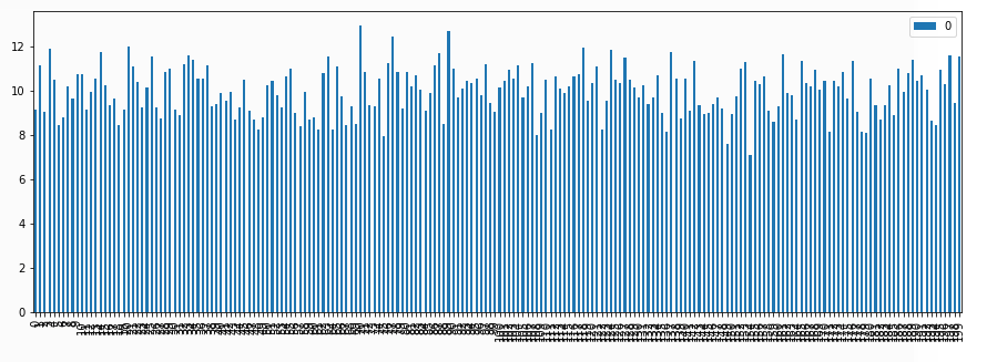
A pandas bar plot visualizes a figure with too dense x-labels
Table of Contents
Issue
I wanna visualize variables in too many dimensions (ex. 200 dimensions). Pandas renders the bar plot. However, the x-label of the plot is too dense; hard to read.
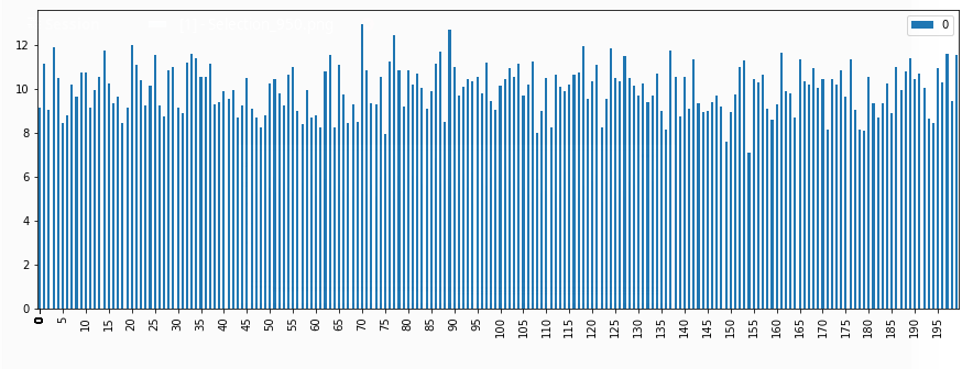
Solution
Use xticks the argument of pandas plot.
Example
|
1 2 3 4 5 6 7 8 9 10 |
import matplotlib import pandas import numpy dim_vector = 200 y = numpy.random.normal(10, 1, size=(dim_vector)) ticks_per = 5 seq_xticks = [ind if ind % ticks_per == 0 else 0 for ind, __ in enumerate(y)] pandas.DataFrame(y).plot.bar(xticks=seq_xticks, figsize=(15,5)) |